Resources
A Quick Guide To The Best Brush Pens For Inking Comics
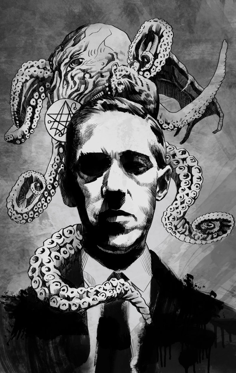
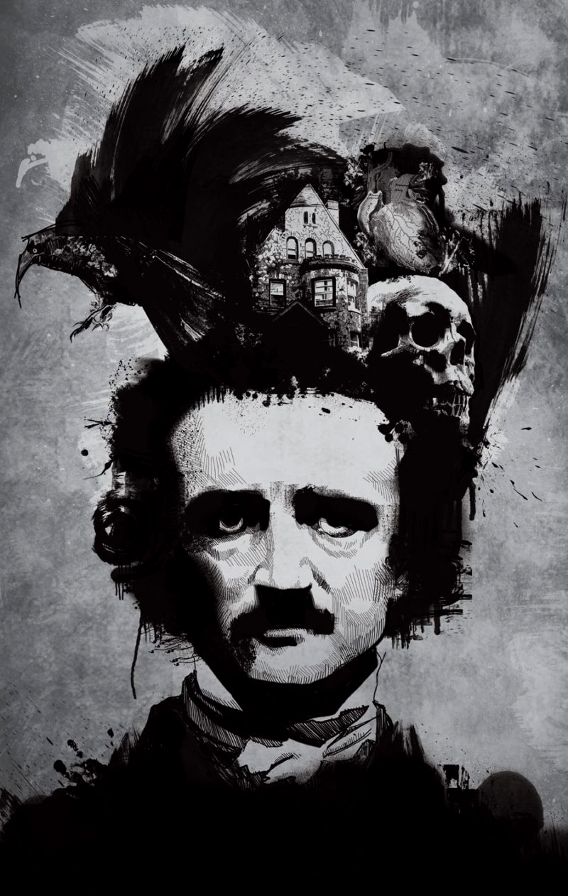
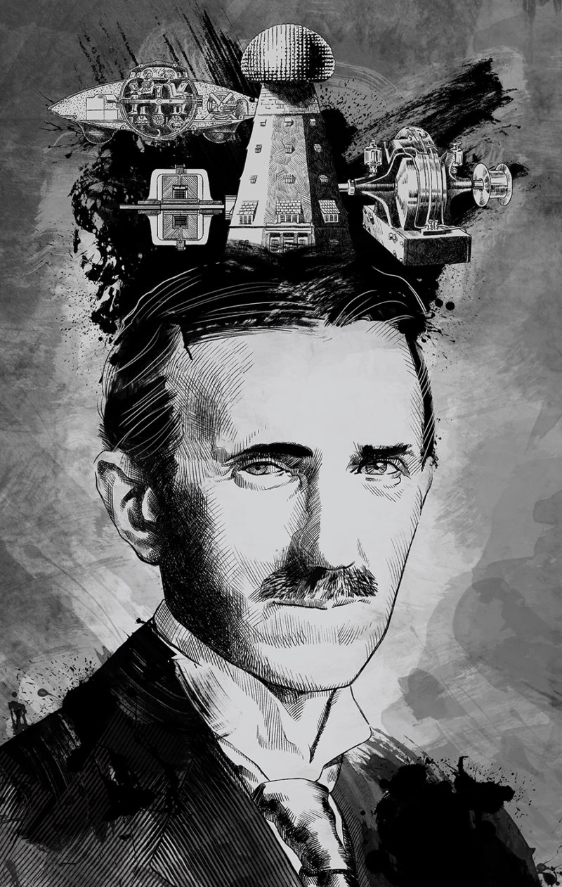
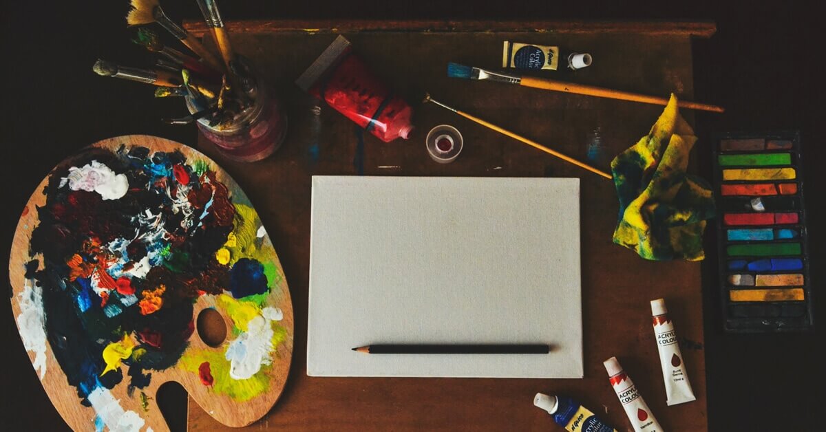
Finding the best brush pens for inking comics is really about trial and error. Drawing doesn’t require the greatest tools but inking well sometimes demands
Finding the best brush pens for inking comics is really about trial and error. Drawing doesn’t require the greatest tools but inking well sometimes demands
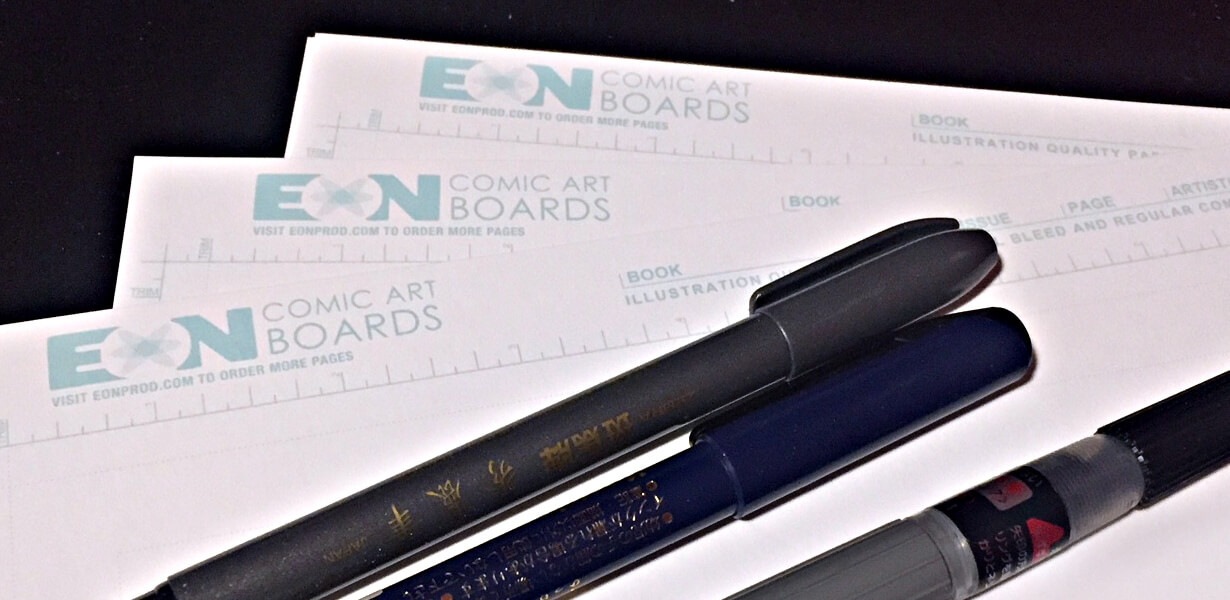
Comic book artists struggle with a strange paradox. A crazy struggle that occurs just by being an artist and wanting to try new things and