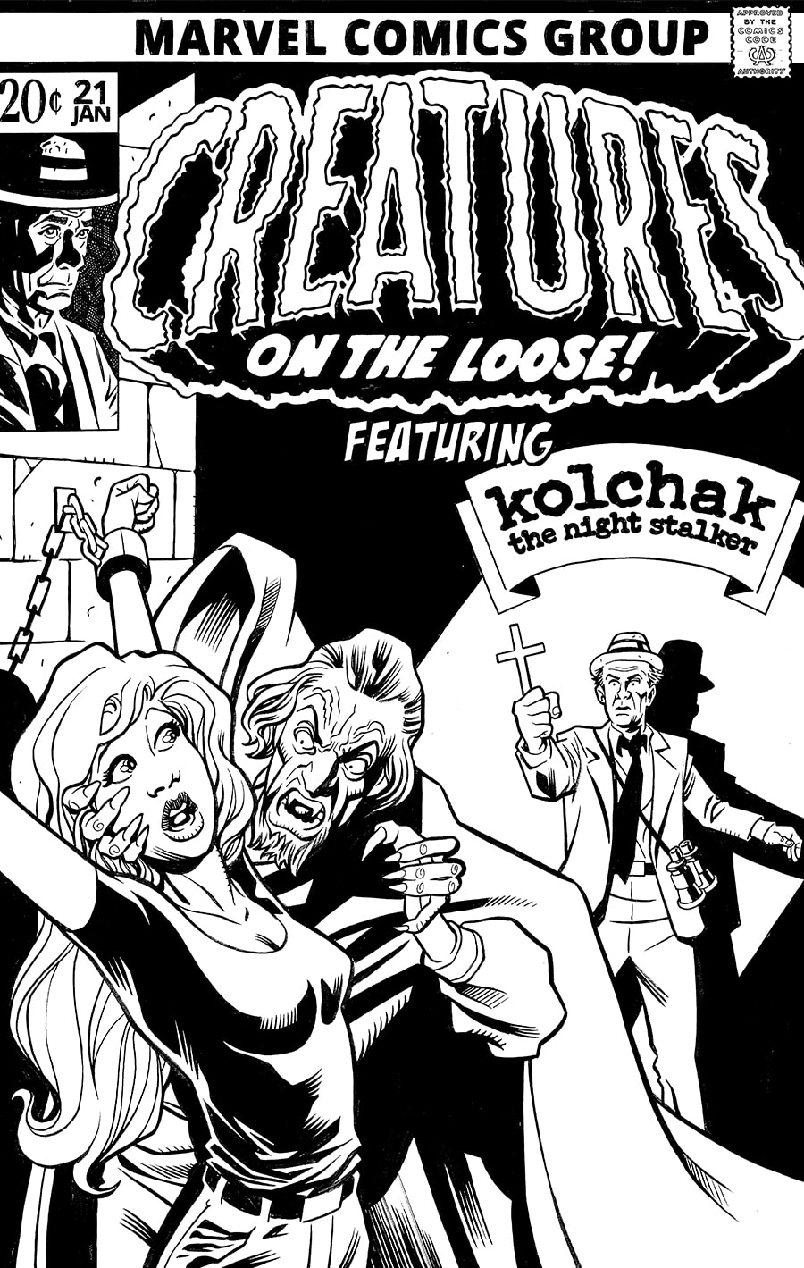
Most of my cover commissions are inspired by classic covers. It’s what the buyers want, and it’s what I give them. This was was no exception.
The inspiration here came from I think two classic covers that just blended together so well. And drawing Dabney Coleman as Kolchak was a whole heap of fun.
But more than anything I think the masthead here really shined. The Creatures font is so organic and texture just the way it was it really made this whole piece fall together.

