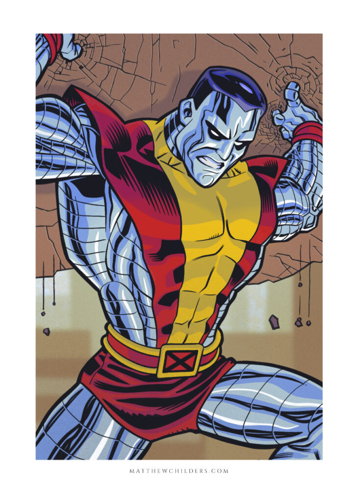
Comic book artists have one of the the hardest jobs in the creative field.
As creators of stories we have a ton of responsibilities beyond just telling the story. We must be costume designers, character designers, sometimes inkers, colorists ect.
It’s a big job.
With something around 4-5 panels a page at around 20 pages a book… the amount of art we create is staggering.
Luckily as we grow as comic book artists, and we put pencil to paper, we each learn ways to speed up our process and also tricks and tips that internally help us just become better artists.
But you don’t want to spend thousands of hours learning these steps on your own.
You don’t. No one does. So I decided to write down some of my favorite tips that help me on a daily basis make my comics. Not just so you could learn but also to remind myself.
It’s even worse when you are constantly pressured by time. I have a family and a day job so finishing pages as quick as I can is paramount. I also want to draw them well. And provide a wonderful experience for the reader.
This is why I wrote my 10 favorite tips to get better and faster at drawing comics.
When drawing Comics always start with a plan.
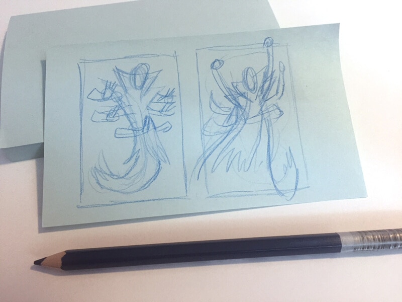
Don’t stare at a white piece of paper! Throw down ideas as thumbnail very small (small enough to fit on a sticky note).
It helps you not only get ideas down quickly but also to edit what you put on paper.
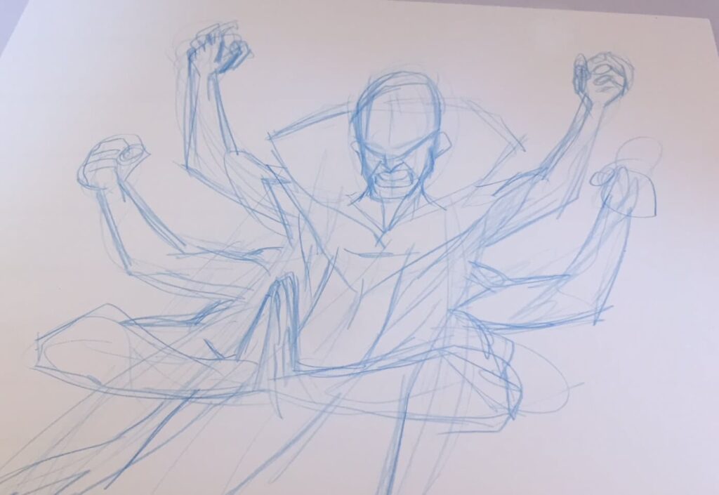
Let it flow through you and learn to scribble
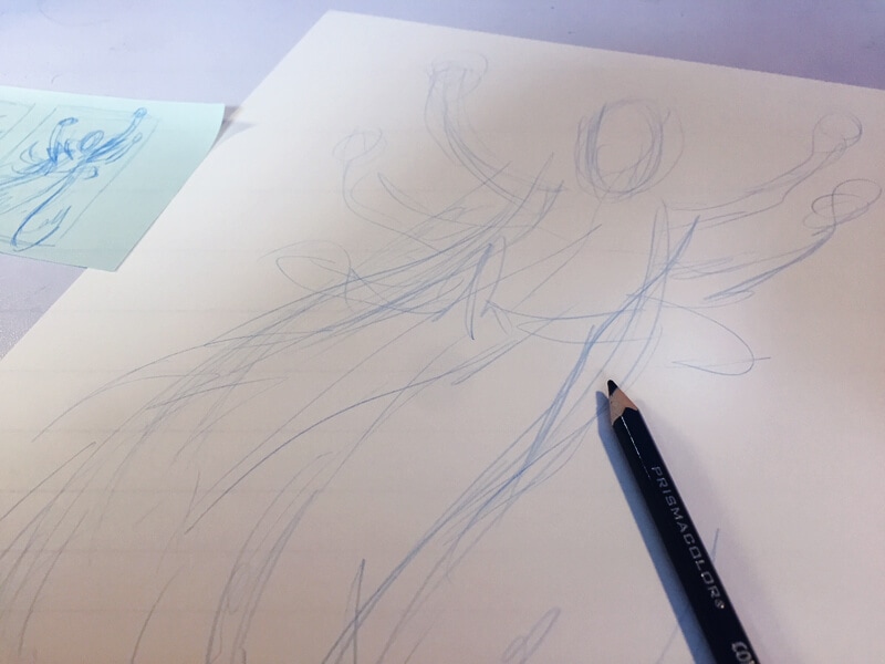
Once you have a plan scribble onto the larger size layout. Don’t start doing shapes or building construction lines.
Scribble.
Move that pencil around. Find the drawing through action, not through rigid shapes. You can worry about proper form later if you have to. Get the movement and energy down first.
Think in terms of shapes and silhouettes
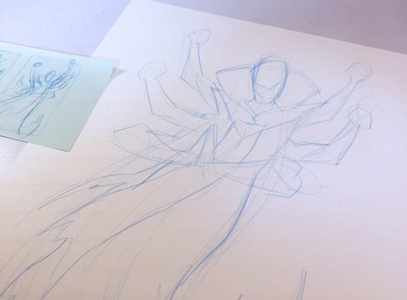
Get down shapes for everything. Don’t worry about drawing the face yet, or the eyes yet, or whatever details concerns you.
Draw the shapes.
Shapes overlap. Shapes can be distinct. Shapes create composition.
Look at your layout. Ask yourself if it expresses the right emotion.
Be expressive. Use gesture, posture, shapes, distortion… anything to get the energy and emotion of a page.
Is the facial expression correct for the scene? Are the arm motions natural?
If you aren’t getting the emotion and gesture, you’re not there yet.
Don’t add unneccessary steps to your process.
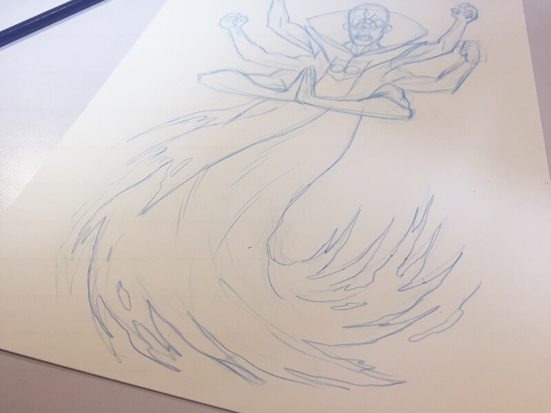
Once you get the layout down. Once you have the gestures and emotion in the page, get to drawing the final drawing as soon as you can.
Don’t keep refining the layout.
The more you refine, the more you edit, the more rigid and lifeless your drawing will be. Energy and emotion come through when you conserve as much of the energy and motion from the original sketch.
Now it’s time to build the structure.
This is where you start building the structure of your characters and backgrounds. Don’t overly complicate. Keep your shapes simple and quick. You don’t have to be precise.
You’re laying down a framework not finishing yet.
Don’t worry about rendering or shadows until almost everything else is done.
Many times I don’t add blacks until the very end. Solid structure makes blacks less necessary but also more impactful.
You’re going to be tempted to use a straight edge. Stop!
99% of the time you don’t need it. There are no straight edges in reality. Everything is imperfect.
If you must use it, keep it only for machinery or things that are alien.
If you must use it for perspective lines, that’s fine but try to draw it by hand first. Instead of using a straight ruler use a curved one. This gives you more motion.
If you feel something is off use a straight edge to check it.
Don’t become reliant on tools that will sap the energy from your drawing.
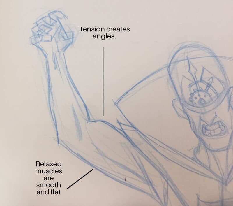
Muscles come in pairs. Use how they flex and relax to define your characters.
When drawing figures muscles or limbs come in two parts. The front and the back.
For every direct action made by a muscle, an antagonistic muscle can and usually causes and opposite movement. When one part of the body flexes the other is loose. When one is smooth the other is angled.
Every time!
This is how you create dynamic form and tension in muscles.
When the bicep flexes it becomes round like a balloon, & the triceps straighten out. This curved/straight relationship works all over the body.
Don’t forget to let your panels breath.
Leave space for word balloons, leave space for word balloons, leave space for word balloons.
Did I repeat that too much?
Let your characters breath.
Leave dead space in panels for copy.
Not only will this reduce the amount of drawing you actually do and save you tons of time, but will also make your compositions better as well
You should start thinking about texture as your drawing takes shape.
Everything feels different. A shirt is different than a wooden table is different than an animals fur.
Don’t get too bogged down worrying about this, but do your best to consider these things.
Not everything needs crazy detail but if you start to build texture into your drawing and characters your work becomes richer.
Learn to accept the 90% rule.
You’re drawing 20-30 pages a book.
Don’t worry that a panel isn’t perfect. Don’t worry that a page isn’t perfect. Don’t even worry that all the pages are perfect.. they’re not. I promise you it’s okay.
Tell the story as best you can right now… then move on.
When you finish a book the next book will be better. You will be better.
Now go draw something.

